[CSS] display 속성 : grid
grid
display:grid
grid-template-columns / grid-template-rows / gap
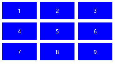
display: grid를 주게되면 grid 관련 속성을 사용할 수 있다.
가장 기본적으로는
열과 행의 수와 너비를 정의하는
grid-template-columns 과 grid-template-rows가 있다.
그리고 행과 열간의 간격을 정의하는 gap 속성도 있다.
예제) 위의 속성을 이용하여 간단한 레이아웃을 잡아보았다.
|
1
2
3
4
5
6
7
8
9
10
11
12
13
14
15
16
17
18
19
20
21
22
23
24
25
26
27
28
29
30
31
32
33
34
35
36
37
38
39
40
41
42
43
44
45
46
47
|
<%@ page contentType="text/html; charset=UTF-8"%>
<%@ page trimDirectiveWhitespaces="true" %>
<%@ taglib prefix="c" uri="http://java.sun.com/jsp/jstl/core" %>
<%@ taglib prefix="fmt" uri="http://java.sun.com/jsp/jstl/fmt" %>
<!DOCTYPE html>
<html>
<head>
<meta charset="UTF-8">
<title>Insert title here</title>
<style type="text/css">
.father{
/* display 속성 grid로 설정 */
display: grid;
/* 그리드의 열의 수와 너비를 정의 */
grid-template-columns: 100px 100px 100px;
/* 그리드의 행의 수와 높이 정의 */
grid-template-rows: 50px 50px 50px;
/* 그리드의 열간 간격 설정 */
column-gap: 10px;
/* 그리드의 행간 간격 설정 */
row-gap:10px;
/* gap:10px;으로 처리 가능 */
}
.child{
color:white;
display:flex;
justify-content: center;
align-items: center;
background: blue;
}
</style>
</head>
<body>
<div class="father">
<div class="child" >1</div>
<div class="child">2</div>
<div class="child">3</div>
<div class="child">4</div>
<div class="child">5</div>
<div class="child">6</div>
<div class="child">7</div>
<div class="child">8</div>
<div class="child">9</div>
</div>
</body>
</html>
|
cs |
grid-template-area-start / grid-template-area-end
위의 예제처럼 기본속성을 이용하여 레이아웃을 잡았다면 이제는 자식 태그들에 속성을 주어
좀더 원하는 디자인으로 레이아웃을 잡을 수 있다.
원하는 자식태그에 grid-column-start / grid-column-end grid-row-start / grid-row-end를 준다,
이때 안의 값은 아래와 같이 grid 간 행/열 사이의 공간들을 기준으로 카운팅한다.
만일 column start를 1 column end를 3을 준다면 파란색 박스 1~2까지의 영역을 말하게 된다. 열도 마찬가지로 적용된다. 반대로 음수로도 접근이 가능하다.
grid-column /grid-row 속성을 활용하여 start와 end를 같이 설정도 가능하다. (start / end)
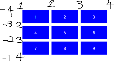
예제) 위의 속성을 활용하여 간단한 레이아웃을 짜보았다.
|
1
2
3
4
5
6
7
8
9
10
11
12
13
14
15
16
17
18
19
20
21
22
23
24
25
26
27
28
29
30
31
32
33
34
35
36
37
38
39
40
41
42
43
44
45
46
47
48
49
50
51
52
53
54
55
56
57
58
59
60
61
62
63
64
65
66
67
68
69
70
71
|
<%@ page contentType="text/html; charset=UTF-8"%>
<%@ page trimDirectiveWhitespaces="true" %>
<%@ taglib prefix="c" uri="http://java.sun.com/jsp/jstl/core" %>
<%@ taglib prefix="fmt" uri="http://java.sun.com/jsp/jstl/fmt" %>
<!DOCTYPE html>
<html>
<head>
<meta charset="UTF-8">
<title>Insert title here</title>
<style type="text/css">
.father{
/* display 속성 grid로 설정 */
display: grid;
/* 그리드의 열의 수와 너비를 정의 */
grid-template-columns: repeat(4,200px);
/* 그리드의 행의 수와 높이 정의 */
grid-template-rows: repeat(4,150px);
/* 그리드의 열간 간격 설정 */
column-gap: 10px;
/* 그리드의 행간 간격 설정 */
row-gap:10px;
/* gap:10px;으로 처리 가능 */
}
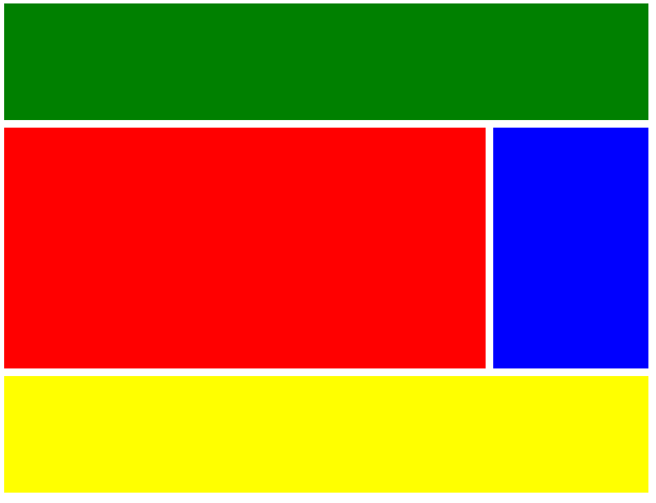
.header{
background: green;
/* grid-area 대신에 자식태그에 grid-column/row-start/end 으로 영역을 설정할수도 있다. */
/* start/end 둘다 설정 하는 방법 */
grid-column:1/5;
/* grid-column-start:1;
grid-column-end: 5; */
}
.nav{
background: blue;
/* 뒤에서부터 카운팅은 -1부터 시작한다. */
grid-column:4/-1;
/* grid-column-start:4;
grid-column-end: 5; */
grid-row-start:2;
grid-row-end:4;
}
.content{
background: red;
grid-column-start:1;
grid-column-end: 4;
grid-row-start:2;
grid-row-end:4;
}
.footer{
background: yellow;
grid-column: span 4;
/* grid-column-start:1;
grid-column-end: 5; */
grid-row-start:4;
grid-row-end:5;
}
</style>
</head>
<body>
<div class="father">
<div class="header"></div>
<div class="content"></div>
<div class="nav"></div>
<div class="footer"></div>
</div>
</body>
</html>
|
cs |
grid-template-areas
위에처럼 자식태그에 영역을 설정하는 방법외에도 부모태그에 areas를 통해 영역을 설정하는 방법도 있다.
사용방법은
부모태그에
grid-template-areas:
" area이름 area이름 area이름"
" area이름 area이름 area이름"
" area이름 area이름 area이름";
자식태그에
grid-area: area이름 정의;
|
1
2
3
4
5
6
7
8
9
10
11
12
13
14
15
16
17
18
19
20
21
22
23
24
25
26
27
28
29
30
31
32
33
34
35
36
37
38
39
40
41
42
43
44
45
46
47
48
49
50
51
52
53
54
55
56
57
58
59
60
61
|
<%@ page contentType="text/html; charset=UTF-8"%>
<%@ page trimDirectiveWhitespaces="true" %>
<%@ taglib prefix="c" uri="http://java.sun.com/jsp/jstl/core" %>
<%@ taglib prefix="fmt" uri="http://java.sun.com/jsp/jstl/fmt" %>
<!DOCTYPE html>
<html>
<head>
<meta charset="UTF-8">
<title>Insert title here</title>
<style type="text/css">
.father{
/* display 속성 grid로 설정 */
display: grid;
/* 그리드의 열의 수와 너비를 정의 */
grid-template-columns: repeat(4,200px);
/* 그리드의 행의 수와 높이 정의 */
grid-template-rows: repeat(5,150px);
/* 그리드의 열간 간격 설정 */
column-gap: 10px;
/* 그리드의 행간 간격 설정 */
row-gap:10px;
/* gap:10px;으로 처리 가능 */
/* area 설정 : . 으로 둘경우 공백*/
grid-template-areas:
"header header header header"
"content content content nav"
"content content content nav"
"footer footer footer footer";
}
.header{
background: green;
/* 자식태그에 area 이름 설정 */
grid-area:header;
}
.nav{
background: blue;
grid-area:nav;
}
.content{
background: red;
grid-area:content;
}
.footer{
background: yellow;
grid-area:footer;
}
</style>
</head>
<body>
<div class="father">
<div class="header"></div>
<div class="nav"></div>
<div class="content"></div>
<div class="footer"></div>
</div>
</body>
</html>
|
cs |
grid-auto-flow / rows / columns
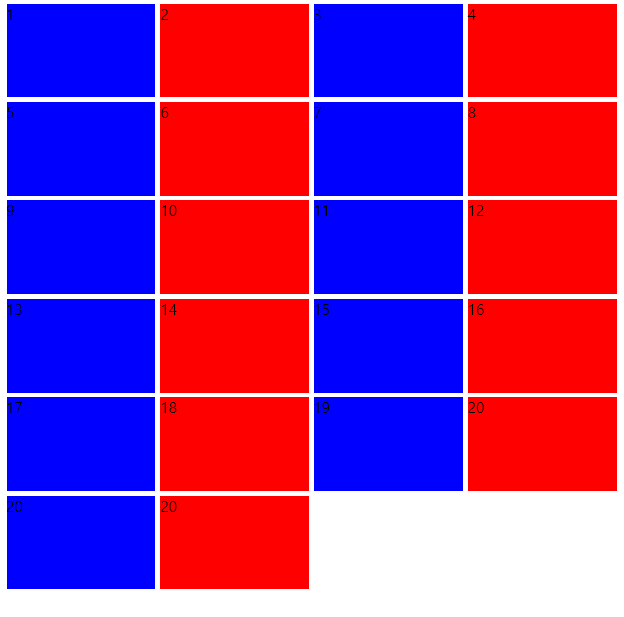
정해둔 열이나 행을 넘었을때 어떻게 할지를 결정하는 속성이다.
grid-auto-flow를 row를 주면 추가적인 행이 아래 행으로 생기게 되고 column을 주면 열이 추가가 된다.
|
1
2
3
4
5
6
7
8
9
10
11
12
13
14
15
16
17
18
19
20
21
22
23
24
25
26
27
28
29
30
31
32
33
34
35
36
37
38
39
40
41
42
43
44
45
46
47
48
49
50
51
52
53
54
55
56
57
58
59
60
61
62
63
|
<%@ page contentType="text/html; charset=UTF-8"%>
<%@ page trimDirectiveWhitespaces="true" %>
<%@ taglib prefix="c" uri="http://java.sun.com/jsp/jstl/core" %>
<%@ taglib prefix="fmt" uri="http://java.sun.com/jsp/jstl/fmt" %>
<!DOCTYPE html>
<html>
<head>
<meta charset="UTF-8">
<title>Insert title here</title>
<style type="text/css">
.father{
display: grid;
gap:5px;
height: 50vh;
/* 지정한 행의 수가 넘어가게되면 row가 사라지게됨 */
grid-template-columns: repeat(4, minmax(100px, 1fr));
/* minmax : 최소 최대 크기 지정(확대 축소시에) */
grid-template-rows:repeat(4, 100px);
/* 위에 짜놓은 template 초과시에 auto 설정 */
/* grid-auto-rows: 100px; */
/* 추가적인 grid를 새로운 콜럼에 추가하려면 grid-auto-flow: column */
/* flexbox에서 flex-direction과 유사한 개념 */
grid-auto-flow: row;
grid-auto-rows:100px;
}
.item:nth-child(odd){
background: blue;
}
.item:nth-child(even){
background: red;
}
</style>
</head>
<body>
<div class="father">
<div class="item">1</div>
<div class="item">2</div>
<div class="item">3</div>
<div class="item">4</div>
<div class="item">5</div>
<div class="item">6</div>
<div class="item">7</div>
<div class="item">8</div>
<div class="item">9</div>
<div class="item">10</div>
<div class="item">11</div>
<div class="item">12</div>
<div class="item">13</div>
<div class="item">14</div>
<div class="item">15</div>
<div class="item">16</div>
<div class="item">17</div>
<div class="item">18</div>
<div class="item">19</div>
<div class="item">20</div>
<div class="item">20</div>
<div class="item">20</div>
</div>
</body>
</html>
|
cs |
'Web > CSS&HTML' 카테고리의 다른 글
| [CSS] display 속성 : block & flex (0) | 2020.11.22 |
|---|

댓글